
When you want to make a big splash for your customer base, and make it easier for customers to bid on the go, you want to use a responsive eBay template for your custom eBay store. At OCDesignsonline, you can choose from a variety of great templates for your eBay listings – including our mobile responsive eBay templates. When you want to boost sales, and simply creating a new site hasn’t done the trick as well as you’d have liked, you may want to make your store more mobile friendly. We can certainly help with that.
About responsive eBay templates
In our eBay video where we discuss responsive eBay templates, we talk about how we can make a fully responsive listing design for you and your business. Your customers won’t have to pinch or zoom in order to get a better view of your products, and we have the navigation embedded in the store’s header – making it easier for your customers to use and navigate through your eBay store. A dropdown menu is available so that customers can browse other categories. It makes it really nice and easy to attract more customers to your store.
You can see in the video that the main difference between standard responsive designs and our fully responsive designs is the way that the store looks and feels when a customer is browsing and making a decision about what he or she wishes to purchase.
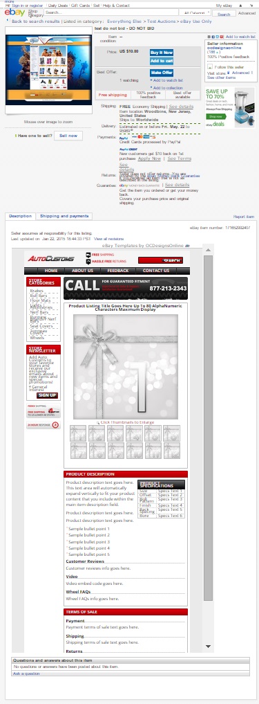
The responsive eBay template’s desktop view
In the desktop view, you can see that the standard listing information is at the top, and when customers scroll down, they can view the custom branded template talking more about the store’s products, policies, and offerings. When a customer clicks on any of the menu items or sidebar items in the branded area of the eBay listing page, they can navigate to other pages in this client’s store. This makes it easy for your customers to find exactly those items for which they search without having to open multiple tabs in their browser windows.
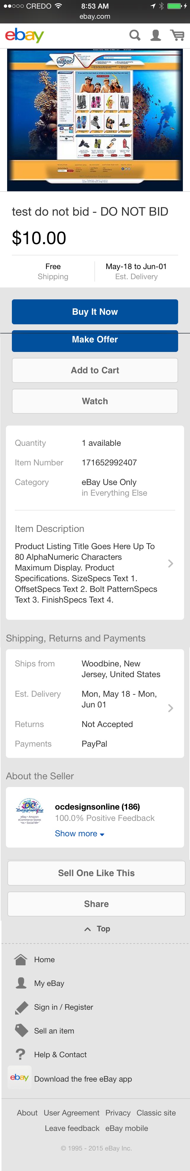
The responsive eBay template’s mobile view
The mobile view, on the other hand, streamlines everything, so your customers don’t have to try to scroll or squint to see all of the information. The landing page for an item looks much like the above-the-fold area of an eBay listing. You have the image of a product, options for buying or watching a product, shipping information, and other technical details about payment options.
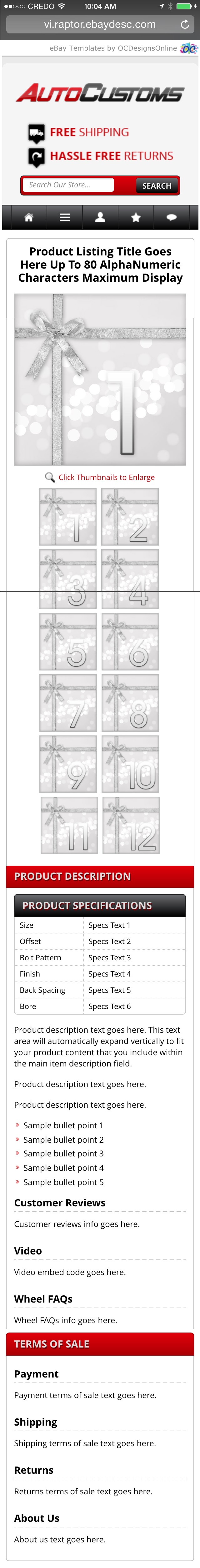
When customers then click on “Item Description,” they are taken to the branded eBay template where they can find more information about the product and browse to other area’s of the client’s eBay store. In the fully responsive eBay templates we create, customers can browse using the header as they would browse any other website, making the site’s navigation comfortable and adaptable to their needs. This, in turn, helps to build a wider client base, and helps to bring customers back to your store.
 Because 1 in 3 customers will make a purchase using a mobile phone, it is a good idea to have a fully responsive eBay listing. At OCDesignsonline, we work hard to ensure that all of our listings are fully responsive and optimized on the back end. That means that all of your images, logos, and information will look just as great on the iPhone as they do on a desktop PC. We use full widths, and we can create photo galleries that will look great on mobile or on a desktop.
Contact OCDesignsonline today for a free quote on your mobile responsive eBay template
At OCDesignsonline, we have a wide array of eBay listing templates from which our clients may choose. Consider your store’s needs and take a moment to browse our portfolio and request a free quote. Also, don’t forget to find us on Facebook, follow us on Twitter and check out our Google+ Page too!